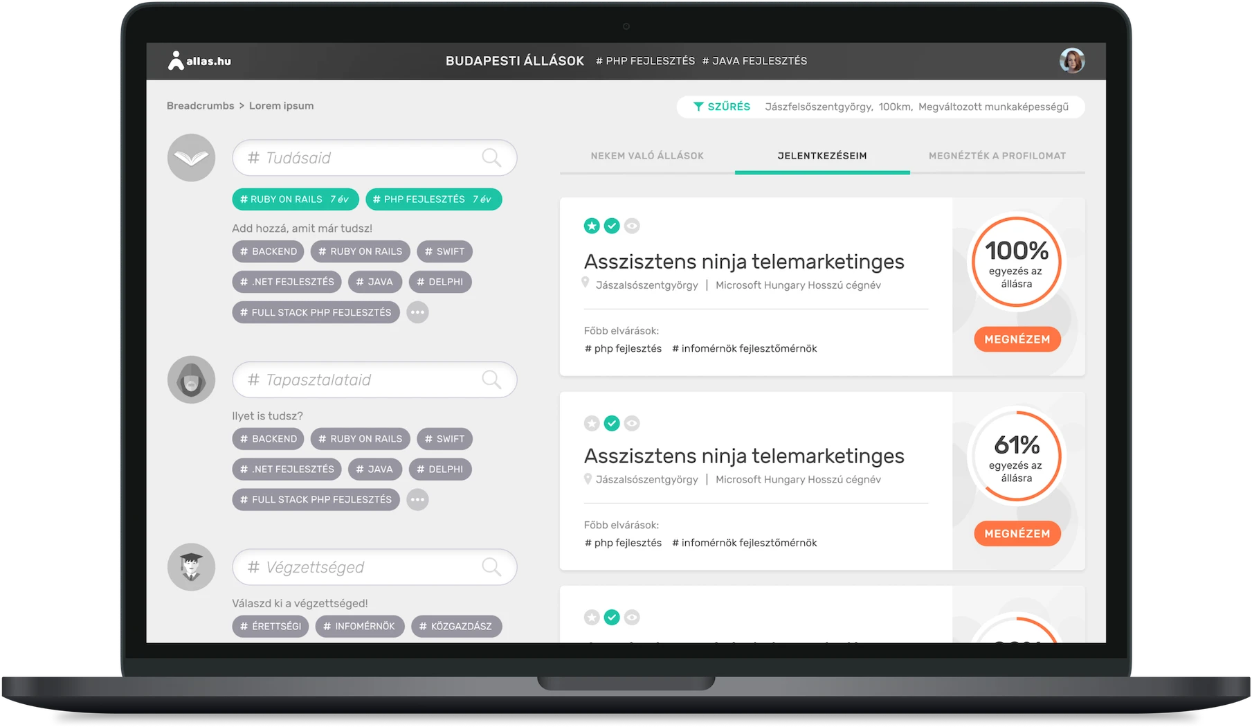
About the App
The user tells the app what they’re good at, what their
strengths are, their work experience, and then it shows the jobs
which would suit the user the most, using the AI algorithm
developed by the team.
My Responsibility
My job was to design the UI and UX of the app from the
ground up
using the initial wireframes, and the research data collected by
the startup's team, which showed that there’s a huge need for a
job seeking platform that’s not filled with advertisements, not
cluttered, and easy to use for people of any working age. I was
also designing the branding (apart from the logo), creating
banners for the marketing campaigns, etc.
The Challenge
The biggest challenge was that
there was no similar web app existing on the market, yet the job seekers had to feel familiar using it without a
learning curve. To achieve this, I had to think out of the box,
and find the most intuitive experience for a new kind of app
such as this.

The Process
✨
Understand and familiarize with the idea and concept.
Who is it for?
How does it fit the over-crowded and stuck-in-the-past market?
How can it be a better choice than the competition?
How to make it stand out, but make it feel already familiar to new users?
Compare each one's strengths and weaknesses, market coverage, target audience, user feedback.
Which apps are the most used today?
Which popular apps have the best user satisfaction?
What do the users expect from a modern app?
Which color (e.g. used on a CTA button) has the best click ratio in the app's destination country? What are the biggest issues of the users of the competition's services?
Using color and text styles, components and auto layout from the beginning to change the UI easily later (initial design system).
Flows can be put together quickly even during meetings using the prepared drafts and the dynamic features of Figma, enabling immediate iteration.
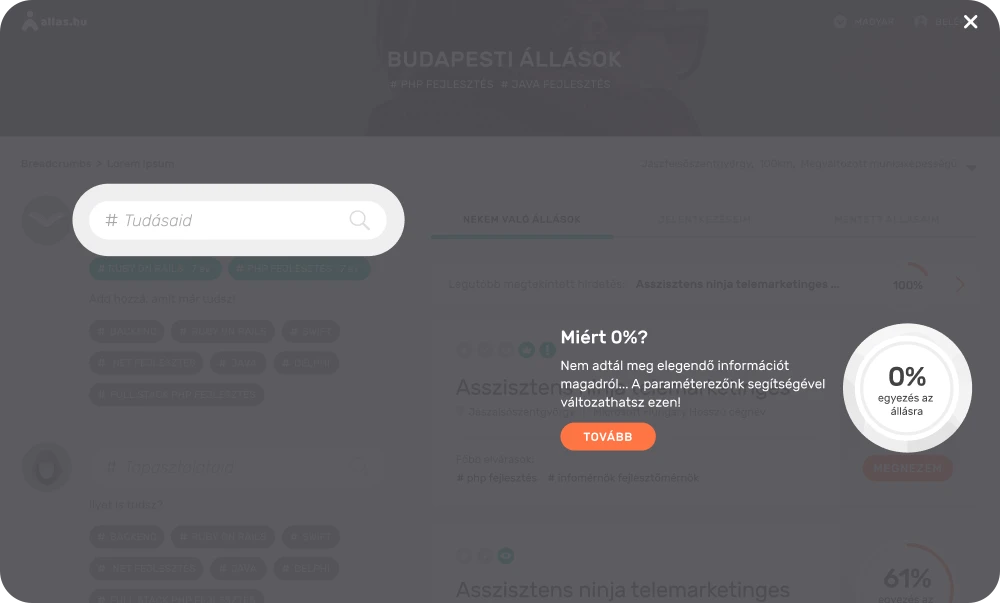
Improving it constantly following the team's feedback and discussions. Introducing colors, finding the ideal fonts and visual style. Creating a short, but easy to understand onboarding process using overlays.
User flows for different use cases, possible user routes, alternative solutions to the chosen ones.
Inviting users of varied gender, age, background, and recording their responses, feelings, questions and ideas.
Using the data collected and analyzed from the testing.
By having a higher amount of users, we now have much more data to make use of.
Open the champagne bottles, then continue iterating, focusing on broadening the user base.
Who is it for?
How does it fit the over-crowded and stuck-in-the-past market?
How can it be a better choice than the competition?
How to make it stand out, but make it feel already familiar to new users?
↓
✨ Research the competition.Compare each one's strengths and weaknesses, market coverage, target audience, user feedback.
↓
✨ Research contemporary apps outside the competition to see what can be familiar and intuitive for the user.Which apps are the most used today?
Which popular apps have the best user satisfaction?
What do the users expect from a modern app?
↓
✨ Analyze collected market research data by the team.Which color (e.g. used on a CTA button) has the best click ratio in the app's destination country? What are the biggest issues of the users of the competition's services?
↓
✨ Create dynamic monochrome UI draftsUsing color and text styles, components and auto layout from the beginning to change the UI easily later (initial design system).
↓
✨ Create user flows together with the team using the draftsFlows can be put together quickly even during meetings using the prepared drafts and the dynamic features of Figma, enabling immediate iteration.
↓
✨ Create detailed UIImproving it constantly following the team's feedback and discussions. Introducing colors, finding the ideal fonts and visual style. Creating a short, but easy to understand onboarding process using overlays.
↓
✨ Create interactive prototypesUser flows for different use cases, possible user routes, alternative solutions to the chosen ones.
↓
✨ Moderated user testing in personInviting users of varied gender, age, background, and recording their responses, feelings, questions and ideas.
↓
✨ Improving user flows, general UX and UIUsing the data collected and analyzed from the testing.
↓
✨ Beta testing with invited users to refine the UX and algorithm furtherBy having a higher amount of users, we now have much more data to make use of.
↓
✨ App release to the general publicOpen the champagne bottles, then continue iterating, focusing on broadening the user base.

Feedback
After the MVP release, the app had a really positive general
feedback from the users and the press too, confirming there’s a
real need for a new generation of job seeking services.